A man stands in front of a tailor's mirror in a navy suit. He thinks: this is navy. His fiancée agrees. They are both certain.
Three months later, the wedding photographs come back. The same suit, in the same light, has photographed as five different colours. In two pictures it is navy. In three it is black. In one it has a violet cast that nobody saw in person. In one candid under tungsten bulbs at the reception, it looks brown.
This is not a printer error. This is what happens when a colour your eye has been calibrated to read all day collides with a camera sensor, a flash, a coloured wall, a candle, and the white balance of whichever photographer is in the room. Couples discover this for the first time on the photographs they paid four thousand dollars for.
I run a tailoring shop that has been making wedding suits in Hoi An for twenty-five years. The patterns repeat. What follows is a colour-by-colour walk through the difference between what your eye sees in the dressing room and what the camera will deliver on the day. The point is to know before you choose.
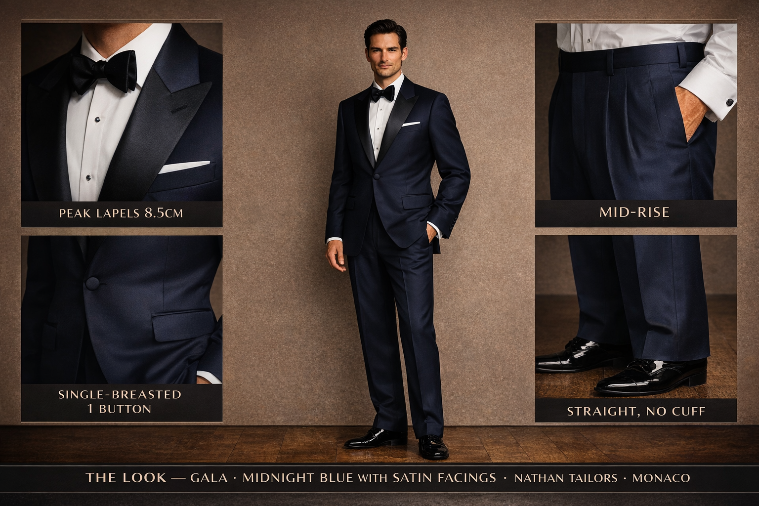
Navy: the colour that becomes black under flash
A flash unit fires a burst of cool, very white light. That light hits navy fabric and bounces back into the sensor, where the sensor — sitting in a darker room — has already opened wide to capture more light than it actually needed. Under flash, navy lifts toward black. The deeper the navy, the harder it falls.
What this means in practice: an indoor evening reception lit primarily by the photographer's strobe will photograph your navy suit as a black suit. The bride's photographer will be unable to fix this in editing without distorting skin tones. Couples then compare the wedding portraits to the engagement-shoot navy and feel certain something happened to the suit between the two.
The tailor's answer: if the wedding is mostly indoor with strobe-driven photography, choose a navy with a slight royal-blue cast rather than a midnight depth, or step up to a brighter mid-blue you can actually see in the photographs. Save deep midnight navy for outdoor afternoon ceremonies where the available light keeps the depth.
Charcoal: the colour that turns blue in candlelight
Tungsten and candle light run warm — somewhere between 2,500 and 3,200 Kelvin. Cool grey fabric viewed in this warm light reflects the warm spectrum back to the eye and reads warm. The camera's auto white balance, however, has been told to correct for the warmth and pull the warm cast back toward neutral. The result: a charcoal suit at a candlelit reception photographs as blue-grey.
You have seen this in your own wedding photos and not known what you were seeing. The grey looked silver-blue, almost steel, and you wondered why the camera's version of grey did not match the version you remembered.
The fix is upstream of the photographer. A charcoal with a touch of warmth — a slight brown or olive cast in the weave — holds its character under candlelight. A pure cool charcoal does not. If the reception is candle-and-tungsten heavy, lean toward a warmer grey or a brown-cast charcoal.
Sage: the colour that goes white in midday sun
Sage and seafoam are quiet, dusty greens. In studio light or in the dressing room, they look like greens. In direct overhead sun — the kind that hits an outdoor noon ceremony — the sensor exposes for skin tones, which sit in a brighter range, and the green washes out. The suit photographs almost cream.
This is the most common shock at outdoor noon weddings. The groom selected a sage suit specifically because it would read green in the photographs. In half the shots, it does not. The fix is either to deepen the green substantially before ordering — what looks like medium sage in person needs to be slightly deeper to survive direct sun — or to schedule the formal portraits in shade or at golden hour, where the colour holds.
If you are not sure which version of green you are choosing, the test that matters is photographing the swatch in the actual ceremony light at the actual ceremony hour. We do this routinely with destination grooms. Hold the swatch on the venue at noon, take a photograph with a phone on auto white balance, and look at the result. The phone is not as forgiving as the photographer's camera, which is exactly why it tells the truth.
Ivory: the colour that flattens skin
This one is uncomfortable to talk about and necessary to talk about anyway. Ivory and cream sit very close to many skin tones. When a person in an ivory jacket is photographed against a fair complexion, the contrast between the face and the jacket collapses. The skin reads pale; the jacket reads pale; the face has no edge.
This is why fair-complexioned grooms in ivory at outdoor sand-coloured beach venues sometimes look, in the photographs, like the tone of their face has been removed. The eye corrects for the gap because the eye has stereoscopic depth and motion to work with. The flat photograph does not.
Two fixes. Either the suit gains a slightly cooler tint — pearl, oat, stone — that pulls away from skin and creates separation, or the shirt and tie do the separating: a deeper-toned shirt under the ivory jacket, or a neckwear strong enough to anchor the face. Couples with deeper complexions do not have this problem; the contrast is doing their work for them.
Burgundy: the colour that drinks tungsten light
Reds in the burgundy and oxblood family sit on the warm end of the spectrum. Under tungsten and candlelight — which already lean orange-warm — the eye continues to read them as red because the brain knows what colour they are. The camera, with its white balance pulled toward neutral, often photographs them as muddy brown or a darker blood colour than was visible in the room.
This is why an oxblood velvet jacket that looked rich and luxurious in the dressing room can come back from the photographer looking like a brown work jacket in a third of the reception shots. The rescue is to test the fabric under a tungsten bulb at home — most lampshades will do — before ordering. If the fabric stays red, you are fine. If it shifts brown, choose a slightly cooler-cast burgundy with more blue underneath.
Polyester: the suit that catches flash like a windshield
This one is not a colour problem. It is a fibre problem. Rental and entry-tier suits — the volume end of the industry runs on these — are blends of polyester with a small percentage of viscose or wool. Polyester reflects light specularly, which is the optical term for "in a single direction, like a mirror." Wool and linen reflect light diffusely, which is the optical term for "scattered, soft." The camera's flash hits polyester and bounces back as a white spike. The fabric, in the resulting photograph, has a hot, plasticky sheen that the eye does not see in person because the eye is moving.
You have seen the result. The groomsman whose suit looks shiny in every photograph. The reception shot where the lapel is a white flare. Couples blame the photographer, who can do nothing about it; the problem is in the cloth.
The honest answer is to avoid polyester suiting for the wedding party entirely. Wool, wool blends with linen or silk, cotton, and pure linen all photograph cleanly under flash. Polyester will betray the photograph in a way you cannot edit out.
Five-different-charcoals lineup: the groomsman problem
Couples who buy off-the-rack suits for a five-man wedding party from five different shops often discover, in the formal portraits, that they have purchased five different charcoals. One reads blue, one reads brown, one is genuinely black, one has a green undertone, one has a pin-stripe so faint nobody noticed it in store. The line, photographed together, looks like a manager's meeting at a regional bank rather than a wedding party.
The cause is dye lots. Two shops can both call a fabric "charcoal" and source from different mills with different dye baths. The eye in a single dressing room corrects for this. The eye seeing all five suits in one frame for the first time on the wedding day does not.
The fix is structural: the entire wedding party should be cut from the same bolt of cloth, or at least from the same mill and dye lot. We do this routinely for destination wedding parties — one fabric, multiple cuts, all from the same roll. The portrait reads as a unit. For a deeper take on the group economics of doing this, our piece on building a wedding-wardrobe rotation across multiple events covers some of the same logic.
White shirts under fluorescent: the green problem
Fluorescent tubes — common in older banquet halls, hotel ballrooms in less-renovated venues, and almost every restroom you have ever been photographed exiting — emit a spectrum that is heavy in green and light in red. White cotton under that spectrum picks up the green and photographs with a sickly cast. The bride knows this from her own dress fittings under fluorescents; the groom never finds out until the photographs are delivered.
The simple defence is to choose a shirt with a touch of warmth in it — a real ivory rather than a paper white, or a French-blue Oxford — for the parts of the day that happen under fluorescent light. The photographer will set white balance for the dominant light source, which for an outdoor ceremony is the sun and for an indoor reception is the strobe. The fluorescent moments — the hallway shots, the bathroom-mirror candids — will not get their own white balance, and the white shirt will go green in those.
The "beige groom disappearing into the beach sand" problem
This is the colour failure I see most often in destination beach weddings, and it is the simplest to prevent. A groom in a soft beige or sand suit photographs against sand-coloured sand and disappears into the background. The bride, in white against the same background, has slightly more contrast — but not much. The wedding party photographs as figures floating against a uniform tan.
The fix is to choose a suit colour that has a different temperature than the sand. Cool blue, cool grey, deep navy if the photography is outdoor, soft pink or sage — anything that lifts the silhouette out of the background. Beige on beige is a colour decision, not a non-decision.
Render before the photographer arrives
The single most useful exercise we do with destination couples is colour-render the venue before any cloth is ordered. We pull the venue type — beach, vineyard, garden, ballroom, urban rooftop — overlay the chosen palette, simulate the time-of-day light, and produce a flat image that looks roughly like a wide group portrait would look on the day.
This catches the cases that this article has just walked through. The navy that the strobe will turn black. The charcoal that the candles will turn blue. The sage that the noon sun will wash white. The beige that the sand will swallow. The polyester that the flash will catch. None of these are problems on the rack of the suit shop. All of them are problems in the photographs that will outlast the suit by fifty years.
We built the tool because we kept having the same colour conversation with bride after bride and could not show them what we meant in words. You can use it as a wedding mood board for testing colours on camera before any orders are placed. Drop the venue, drop the season, drop the palette, and look at it. If something fails on screen, it will fail in person.
Reading the venue before the day
If you have not yet locked the venue, one visit matters: same hour, same season as the ceremony, with a phone camera. Photograph the room. Look at the images on a real screen the next day. Note where the light runs warm, where it runs cool, where it is heavy with green or purple — usually walls, drapes, or a tent ceiling. We do the swatch step remotely for destination couples — they hold the cloth under their phone in the venue, send the photo, and we adjust the selection from there.
To start the conversation for your venue, our destination wedding page is the place. The camera does not lie about the suit. It sees a different version of it than your eye does. The work is to know that in advance — and to choose accordingly.